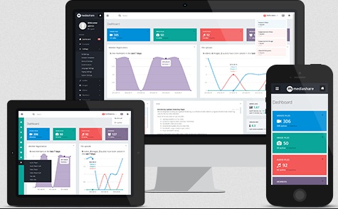
Responsive Videos For The Smartphone Generation
On 21st April, Google released an update in its algorithm- they called it the Mobilegeddon.
The gist of the update was that Google would begin to give more weightage to websites that were responsive.
So, while owners and marketers across the globe went about making that their website designs were responsive, did they stop to think about their visual content?
Think Videos and Infographics. Oh!You didn’t really give them much of a thought, did you?
Well, in the larger scheme of things, you might think this doesn’t really matter. So let’s try and refresh our knowledge a little, shall we?
- Visuals are processed 60,000 times faster than text,
- Over 80% of all content being consumed online is visual,
- 71% marketers believe Visual Content increase their conversion rates.
We could go on and on discussing the benefits of showing rather than just talking, but let’s get back to the topic at hand.
Right, so is your visual content, responsive?
But why does it need to be responsive?
First, mobile consumption is generally on the go and relies on immediate payoffs. Research has shown that mobile visitors are less involved and committed to your content than desktop visitors. This translates to faster load times and easier to consume data.
Right now, its a good time to visit your visual content and check how fast it loads. If it takes more than a second, you are in for some seriously high bounce rates.
Second, the point about immediate payoffs means that your content needs to be in an easily digestible format. So, the numbers or images that you included in your infographic really need to be big enough for easy viewing.
So, what should you do?
The best way out is to include this directive in the brief to your creative agency. A simple ‘please ensure the graphics look good on all devices’ should do the trick.
They will then ensure that the text is big enough or the graphics are not too close together. Minute details, really matters and get noticed if an infographic is open on phone. But there is a better way out. Invest in different graphics for different devices. It is cheaper than you think.
Step 1: Analyze your traffic flow
Do an analysis of your traffic. Do you receive over 20% of your traffic on mobile? Or, are you looking to increase your traffic on mobile?
This is also a good time to look at your competitor’s traffic flow.
Step 2: Analyze content on different devices
Almost a year back, Google updated their Keyword Planner.
What this means is that you can easily get to know the breakdown of search traffic by device.
This knowledge is crazily, empowering.
How? Now you know whether that Infographic you have planned, needs to be mobile friendly or not.
You can know, whether that video series you are investing in should be tailored to mobile or web.
Smart, right?
Step 3: Talk to your Creative Agency
If your agency hasn’t spoken to you about this, maybe you should. Since they are already building content for you, a few tweaks in the visuals shouldn’t cost you an arm and a leg.
An agency may charge you 15-50% of their fees to create a mobile version or a web version.
Investing in this will be a much smarter move than losing all that traffic.
Where not to compromise?
Let’s say you were to pick and choose amongst all the Visual Marketing Content that you were creating. Which one is absolutely non-negotiable?
Clearly, it’s your Explainer Video.
It wasn’t cheap to begin with. And you chose to go ahead with it because you were looking to:
- Increase Conversion Rates
- Increase Sales
- Increase Rankings on Search Engines
It will not be too smart on your part to not ensure that you market it far and wide.
So why not make the whole deal more foolproof and ensure your video looks good at all resolutions?
There is an easy way to manage the resolution:
1) On your server side you could detect the user agent of the browser and if it matches against a mobile browser then you could change the src of the video to be your lower resolution one.
2) Use Javascript / jQuery to detect if the user is using a mobile browser and do the same thing, change the src of the video to be the lower resolution one.
And ensure that you create a video with graphics that look good on all resolutions.
If you already have a video, then approach the agency that made it for you. They should be able to create one for you for a different device by just tweaking a few graphics around.
Conclusion:
In this age where everything is going mobile, we need to ensure all visual content is too. By working smarter, we can ensure that our images and videos actually do lead to higher consumption and conversion rates on all devices.
Subscribe to Crackitt's Visual Marketing Workshop
Get exclusive visual marketing lessons and business growth hacks right inside your inbox.
Previous:


