Rotating banners, to put it simply, are visual slideshows running on a loop at the top of your homepage.
In the web designer’s community, these rotating banners or image sliders are rather referred to by a nobler term, that is, carousels.
But for marketers, rotating banners are just a promotional area, where they display 4 to 8 promotional messages, a mix of images, videos or texts, in an auto-rotating loop.
While it’s a clever design element, rotating banners miserably fail at driving conversions since only about 1-2% of your website visitors will ever click on a rotating banner (and that too might have been an accidental click). Here’s why.
REASONS WHY YOU SHOULD NOT BE USING ROTATING BANNERS
1. Banner Blindness! Rotating banners are considered as an ad, and therefore ignored by the majority of your website visitors. As mentioned earlier, only 1 out of 100 website visitors would click on a rotating banner. In fact, 86% won’t even recall the banner. It’s as if it doesn’t exist.
2. Large file size of the image banners weighs on the website load speed, which is not good if you consider the fact that you are losing 7% of visitors for a 1 second delay in page load. In terms of money, Amazon revealed that they would lose approximately $1.6 billion in sales revenue every year for a mere 1 second page delay. That’s a huge loss.

3. Rotating banners are good for desktop and laptop users but definitely not for mobile users provided its small display size (not to mention that many mobile devices don’t support flash used in the carousel). You would need a different website compatible with mobile devices, without any rotating banners. Understand that 60% (or more) of your website traffic comes from mobile. No wonder, Myntra shut down its website dealings and became an app-only ecommerce fashion retailer.
4. Visitors have to wait to view all the banners, and if they fail to read the content in one image, they may have to sit back and wait for that image to show up again (unless you have provided navigation controls to maneuver through the banner content).
5. Motion distracts the user from consuming other important content in the page.
STILL IF YOU MUST USE ROTATING BANNERS, THEN DO IT THE RIGHT WAY:
1. Use Not More Than Two-Three Slides In Your Carousel.
Rotating banners usually hoard around 4 to 8 pieces of content messages. That’s too many. Those multiple slides can overwhelm your visitors to the point that they cannot decide which one to click on. Hence, they ignore the banners altogether.
To tackle this problem, Microsoft displays only two messages via its rotating banners.

You may also want to follow suit by putting up a rotating banner with just 2 (or even 3) banner messages.
2. Give navigation control to the user.
Sometimes, the user is just about reading the content on a certain slide when it switches to another slide, and they have to sit back and wait for that particular slide to show up again. This kills the user’s time.
The better thing to do would have been providing the user with the navigational control like Black Ninja does with their carousel.

Better yet, they also provide numbers for easy recollection (although Canon does it far better with thumbnails).
3. Preview. Let the users see all the banners at a glance.

Canon handled its homepage carousel too well. It has provided thumbnails so that visitors can see at a glance all the images hold by the slider. This saves the user’s valuable time, and it makes for an interactive design too. Also, since all the cards are shown, the user can easily decide which one to pick up and explore.
4. Change the visual content but not the CTA.
Meet video carousels.
Rather than the standard still images that the traditional rotating banners are identified with, Airbnb did something different. They use video carousels i.e. short, beautiful video clips are being played on a loop (there’s no audio but it still is mesmerizing).
One thing is obvious. Video carousels just might be the cure for banner blindness that carousels are associated with.
The clever thing here is that, while the visuals go on their merry-go-round ride, Airbnb’s brand message stands firm. Which is cool. It must have been highly effective in persuading new visitors to use the Airbnb service.
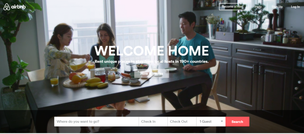
You can click on the “How It Works” CTA button at anytime (and, interestingly, it doesn’t even take you to another page… Airbnb just has a great user intereface).
The lesson to learn here is that the top portion of your website is the first thing that visitors would see and therefore should be dedicated to explaining your business to visitors.
Here, Airbnb greets its visitors with a resonating website headline, the subtitle further explains the business proposition to newcomers, and just below it is that interactive “How It Works” CTA button. These content pieces hover over the ever changing visuals, a conversion-driven carousel indeed.
Note: Besides the muted video carousel, Airbnb also uses the standard image carousel. If you would scroll through the website, you would see another carousel, this time with still images and CTA in each slide.
5. Videos Drive Higher Conversions Than Rotating Banners.
You saw how Airbnb uses short, muted video clips to captivate their audience and arouse in them the desire to use Airbnb’s service to buy that same experience. Several websites are following this style, chucking away the image slides for engaging, muted video clip. Several more have gone ahead and put on an actual video on top of their homepage. Apparently, videos were discovered to be more persuasive, increasing the likelihood of a purchase by 85%.
No wonder, videos are replacing the image carousels, especially after Dropbox’s success story (putting an explainer video on its homepage gave Dropbox 10% more conversion, amounting to a whopping $48,000,000 in extra revenue).
Moreover, while website visitors won’t engage with your rotating banners, they just can’t resist clicking on a video icon. In fact, videos are 41% more likely to get clicked than text listing.
You can also showcase your big portfolio and powerful business features with just one short video, usually of 60 to 90 seconds in length.
CAROUSEL ALTERNATIVES. DON’T WANT TO USE ROTATING BANNERS?
i) Equivalent Buckets
Rather than using a carousel to show your slides one after another in a big way, you could just use equivalent buckets to display them side by side. So, if you have three slides in your rotating banner, you could resize them to a smaller display size and lay them out side by side just like The Brief does in the following image.

This way visitor can see all the content slides at a glance, and it even works for mobile devices too since you don’t have to use any fancy flash scripts.
ii) Grids
Other than equivalent buckets, you could also use grids to spread out your rotating banner slides into small sections on your webpage such that visitors can see each one at once, and go through them one by one.

Using grids is a great way to feature new contents.
You don’t have to stick to regular box pattern. Use unusual geometry to pique the interest. Because when everything is different, people tend to view them differently.
CONCLUSION
Carousels, or rotating banners, are not necessarily a bad design element. In fact, I like them too. They make your website look cool.
However, website visitors tend to ignore them (they think it’s an ad), and therefore it’s better not to use them in your homepage… if you are looking for higher conversions and not just to “wow” your visitors.
Still if you must use carousels, then follow any one of the above mentioned carousel design technique, or its alternatives (you know, the grids and the equivalent buckets), and while you‘re at it, monitor and engage in A/B test to see which one drives the highest conversion rate. After all, design is just a medium to put across the message, and what matters most is whether people click on your CTA button and respond to your call.
Get exclusive visual marketing lessons and business growth hacks right inside your inbox.
Previous:
Crackitt is a Conversion-focused Design Agency that specializes in the production of Explainer Videos, Infographics & GIFs. We spend time understanding your core business offering. This knowledge is collected through a thorough analysis of your users which we then use to create stunning visuals (videos or graphics).
5 Jacobs Close,
Epping NSW 2121
174, Udyog Vihar Phase 1,
Gurgaon 122016,
124 Symonds Street Eden Terrace,
Auckland 1010
2035 Sunset Lake Road, Suite B-2,
Newark, Delaware, 19702


