Visual content is a big deal. It’s effective because the human brain craves for it.
Research tells that visual content is over 40 times more likely to get shared on social media than any other types of content. That’s how much people love visual content.
However, there’s a catch.
Visual content marketing is best… as long as you don’t mess up!
Because, besides the good ones, bad visual content too get shared and talked about over the web. People share them because they may want to criticize the brands for their folly or just have a good laugh.
We have made a list of some brands and businesses which have committed blunders in their visual ads, causing an uproar over the web.
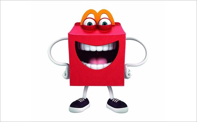
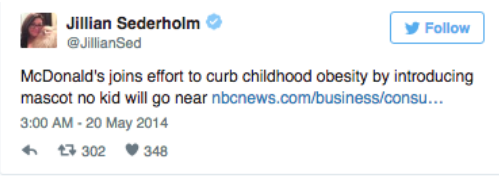
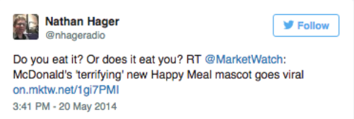
In 2014, McDonald’s USA team had two things up their sleeve. They had a new item on their menu – a low fat yogurt option for kids. The other big reveal was the brand new Happy Meal mascot to serve “as an ambassador for balanced and wholesome eating”.
According to McDonald’s, this Happy Meal character, or Happy for short, was all “about bringing more fun and excitement to kids’ meals.”
However, America wasn’t all happy to see Happy. Following its official introduction on McDonald’s Twitter page, Happy got mocked and meme-d over the social media.
Lesson(s) Learned:

In a comic strip recently released by DC Comics, there was a small but silly mistake. The DC Comics artist wrote – “All translated from Pakistanian”, as if Pakistan speaks “Pakistanian”. Their official language is called Urdu, not Pakistanian.
Readers were quick to pinpoint this dumb mistake to DC’s embarrassment. And, social media was quick to make fun out of it.
A little bit of research wouldn’t have hurt, right?
Lesson(s) Learned:
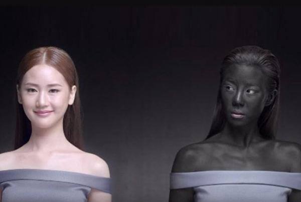
To promote their skin-lightening product, Thai beauty brand Seoul Secret launched an appalling “white makes you win” video advertisement on January 7, 2016.
The one-minute video ad features a model in blackface and gives the racist message that you need to be white to win.
The campaign was met with harsh criticism from around the globe for its racist tone.

Another user said, “Suggesting people with dark skin are losers is definitely racist.”
Following the public backlash, Seoul Secret pulled the video and related ads on the second day. The company also posted an official apology over Facebook.
Lesson(s) Learned:
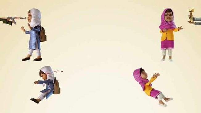
Ogilvy India released a rather distasteful Kurl-On Mattress ad, which depicts a cartoon image of Malala Yousafzai (a teenage activist who was awarded the Noble Prize). The ad shows Malla fall after getting shot by the Taliban, and then ‘bounces off a mattress’ to rise for a humanitarian award. It was a sick joke. Viewers labeled the ad as “shocking and insensitive”.
Ogilvy India apologized for the ad, and expressed that it was “contrary to the beliefs and professional standards of Ogilvy & Mather and our clients.”
Lessons Learned:
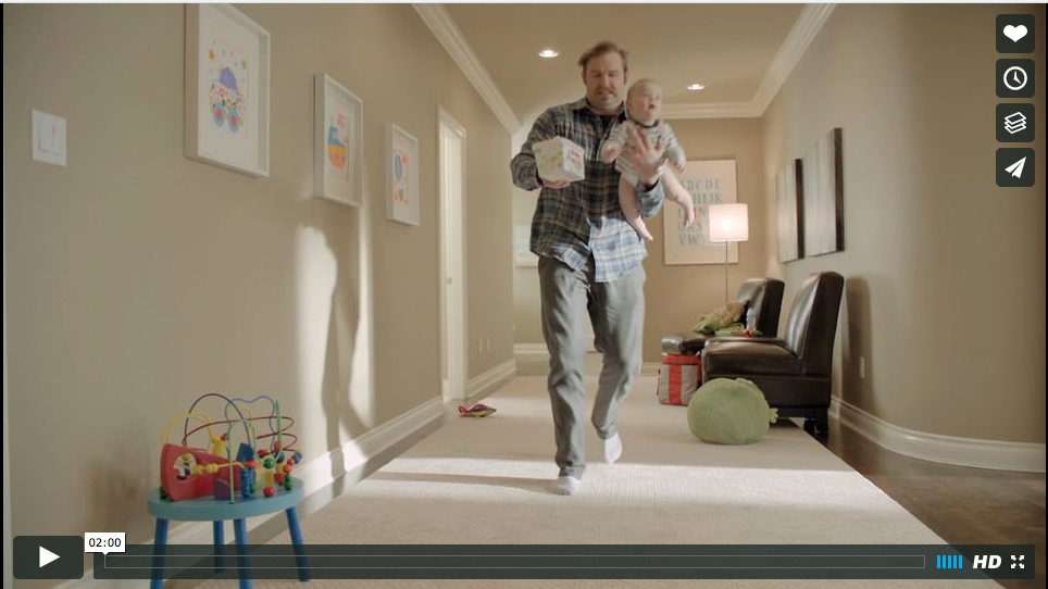
On March 2012, Huggies rolled out a “have dad put Huggies to the test” diaper ad over their Facebook page as part of a campaign. The commercial belittled dads and depicted them as clueless and inattentive parents.
“To prove that Huggies diapers and wipes can handle anything,” a female narrator says, “we put them to the toughest test imaginable — Dads.”
One scene showed dads neglect to change their babies full diapers because they were too ‘busy’ watching sports on the TV.
It was an insult to dads, especially at a time when dads have taken up equal parenting responsibility and, in some cases, were the sole caregivers for their babies.
One dad started a petition “We’re Dads, Huggies. Not Dummies” which got more than 1,000 signatures. And, hundreds of other dads took to the blog to give Huggies a backlash.
It took a serious turn when 200 dad bloggers held their first convention – Dad 2.0. Huggies quickly dispatched representatives to apologize to the attendees.
The company pulled down the video from their Facebook page, and replaced them with good ads showing dads taking good care of their babies to make up for their mistake.
Lessons Learned:
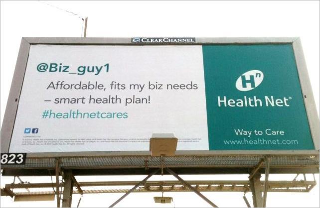
HealthNet’s brand credibility took a hit as it was discovered that they were using fake user testimonials in their billboard promotion.
Apparently, that @Biz_guy1 tweet doesn’t exist. It’s a fake one. You would wonder what other false claims the company is making.
Lessons Learned:
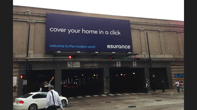
Esurance put on a billboard, with the tagline “cover your home in a single click”. It was a good banner except for one small kerning issue. When seen sideways or from a distance, the banner message appeared obscene.
Well, that was an innocent mistake from Esurance’s side, but it caused them a whole lot of embarrassment.
Lessons Learned:
Rhode Island Commerce Corporation had planned a $5 million tourism campaign around the theme “Cooler and Warmer”. As part of the grand scheme to attract more visitors, on March 2016, they released a promo video of Rhode Island over their website and social media.
The $120,000 video features a new state logo, and looks nice except for one big mishap.
The video production agency had made an epic blunder by including footage of Iceland’s Harpa concert hall in what was meant to be a Rhode Island only video. The said footage runs through 0:09 and 0:11, and shows a skateboarder kick-flipping in front of a glass building.
Some hawk-eyed viewers pointed out that the glass building was not a Rhode Land feature but rather the well known Harpa concert hall in Reykjavik i.e. Iceland’s capital. Oops!
The video was pulled down, but not before governor Gina Raimondo had tweeted about it, and was mocked by the public.
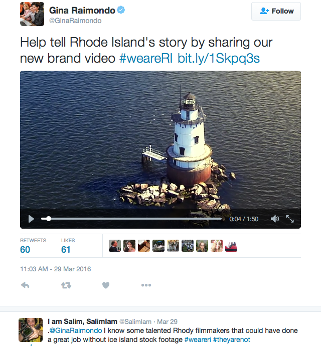
“It’s unacceptable how many mistakes were made in this roll-out and we need to hold people accountable, because Rhode Islanders deserve better, taxpayers deserve better,” Raimondo told reporters. In the aftermath, the marketing chief quit his job. Apparently, someone had to take the blame.
Lessons Learned:

New year 2016 for Coca Cola turned out to be a disaster as it managed to upset two countries over the disputed territory of Crimea.
On December 30, Coca Cola’s Russian franchise had uploaded a festive map of Russia in a popular Russian social media site called Vkontakte.
However, the map incited angry response from the Russians, who were annoyed at Coca Cola for not including Crimea, Kaliningrad and other newly annexed regions in the Russian map.
So, on January 5, Coca Cola posted an apology and, for good measure, also uploaded a new and updated map, showing Crimea as a Russian territory.
The new map, however, left the Ukrainian side outraged and triggered angry responses over the social media with hashtags like #CrimeaisUkraine and #bancocacola.
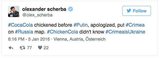
Squeezed between the rivalry of the two countries, Coca Cola decided to “delete the item which caused the upset.”
Lessons Learned:
CONCLUSION
While reading about these visual content blunders, if you are a marketer, you might have noticed that all these brands made headlines and their search rankings rose tremendously.
Now before you get any smart ideas about causing uproar in the social media with a nasty ad just to get publicity for your brand, be warned.
Vitaly Borker, the owner of DecorMyEyes, thought that negative publicity could be the shortcut to the #1 spot in the search results.
He sure got the top spot in google search and made headlines, but then got a prison break for malpractice.
So, as the marketer or owner of your company, avoid knocking on the wrong door. Make sure you are telling the right story through your visual content.
Get exclusive visual marketing lessons and business growth hacks right inside your inbox.
Crackitt is a Conversion-focused Design Agency that specializes in the production of Explainer Videos, Infographics & GIFs. We spend time understanding your core business offering. This knowledge is collected through a thorough analysis of your users which we then use to create stunning visuals (videos or graphics).
5 Jacobs Close,
Epping NSW 2121
174, Udyog Vihar Phase 1,
Gurgaon 122016,
124 Symonds Street Eden Terrace,
Auckland 1010
2035 Sunset Lake Road, Suite B-2,
Newark, Delaware, 19702


